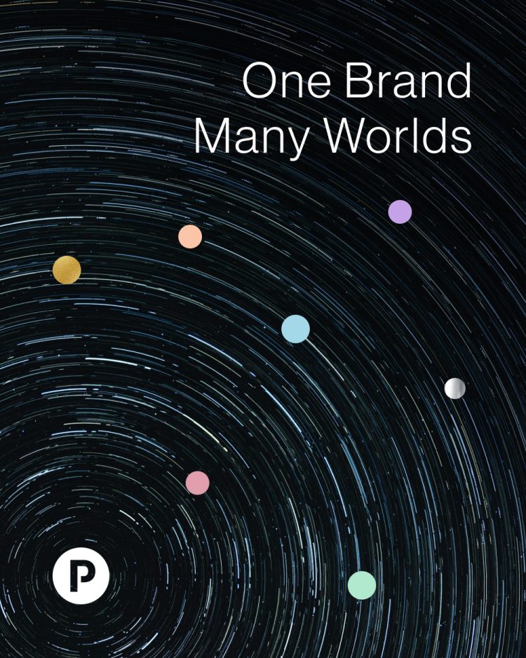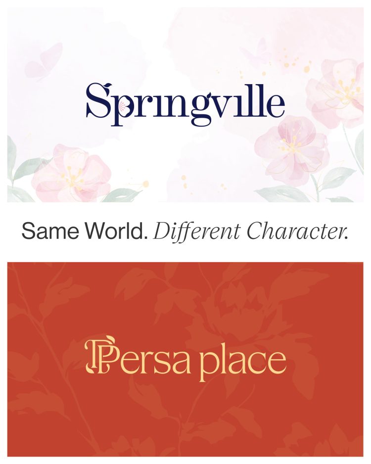
This is one of the most practical tensions in brand architecture. If a sub-brand sits too close to the masterbrand, it becomes invisible, the offer is absorbed, and the project loses its reason to exist. If it sits too far away, the ecosystem fragments, the masterbrand loses equity, and the launch feels like a separate conversation.
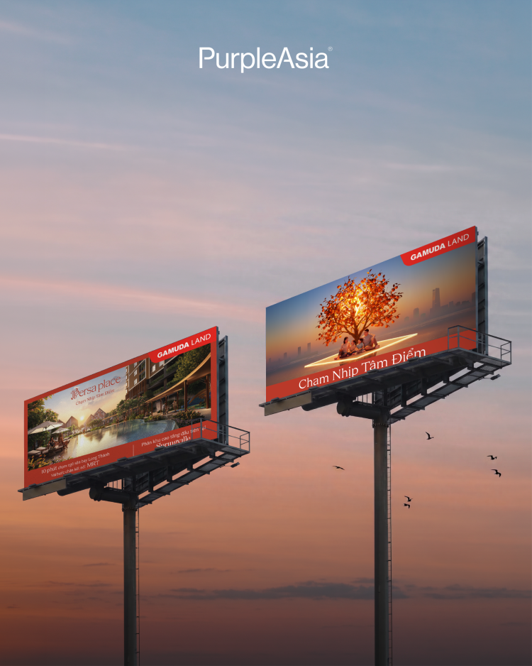
For Persa Place within Springville, the answer came from personality rather than aesthetics.
Springville carries the larger promise: a township built around long-term growth, community, and a more connected way of living. It is nurturing, future-facing, and expansive.
Persa Place needed to do something different. As a more active, socially driven precinct within the Springville ecosystem, it had to bring movement, energy, commerce, gathering, and the feeling that life was already happening.
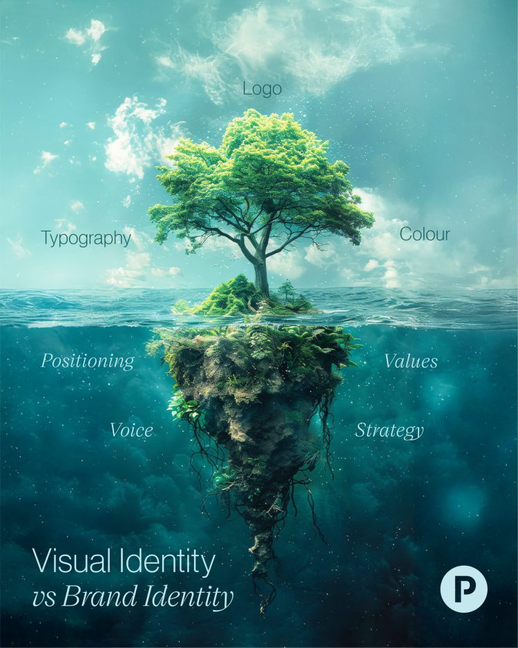
The temptation in projects like this is to default to visual differentiation: a different palette, typeface, and tone. Sure, sometimes that works, but it’s still surface. What holds a brand ecosystem together is a consistent set of values expressed through distinct personalities at each level. Get that right, and the visual system has somewhere to go. Get it backward, and you’re forever fixing inconsistencies that were really strategic gaps.