Most packaging rejuvenation projects chase the aesthetic of youth, calling for bolder colours, looser type, a mascot, a meme perhaps. But they often miss asking how the brand should speak to younger audiences. The result feels current for about a year and a half, but then it’s dated again and the client is back where they started.
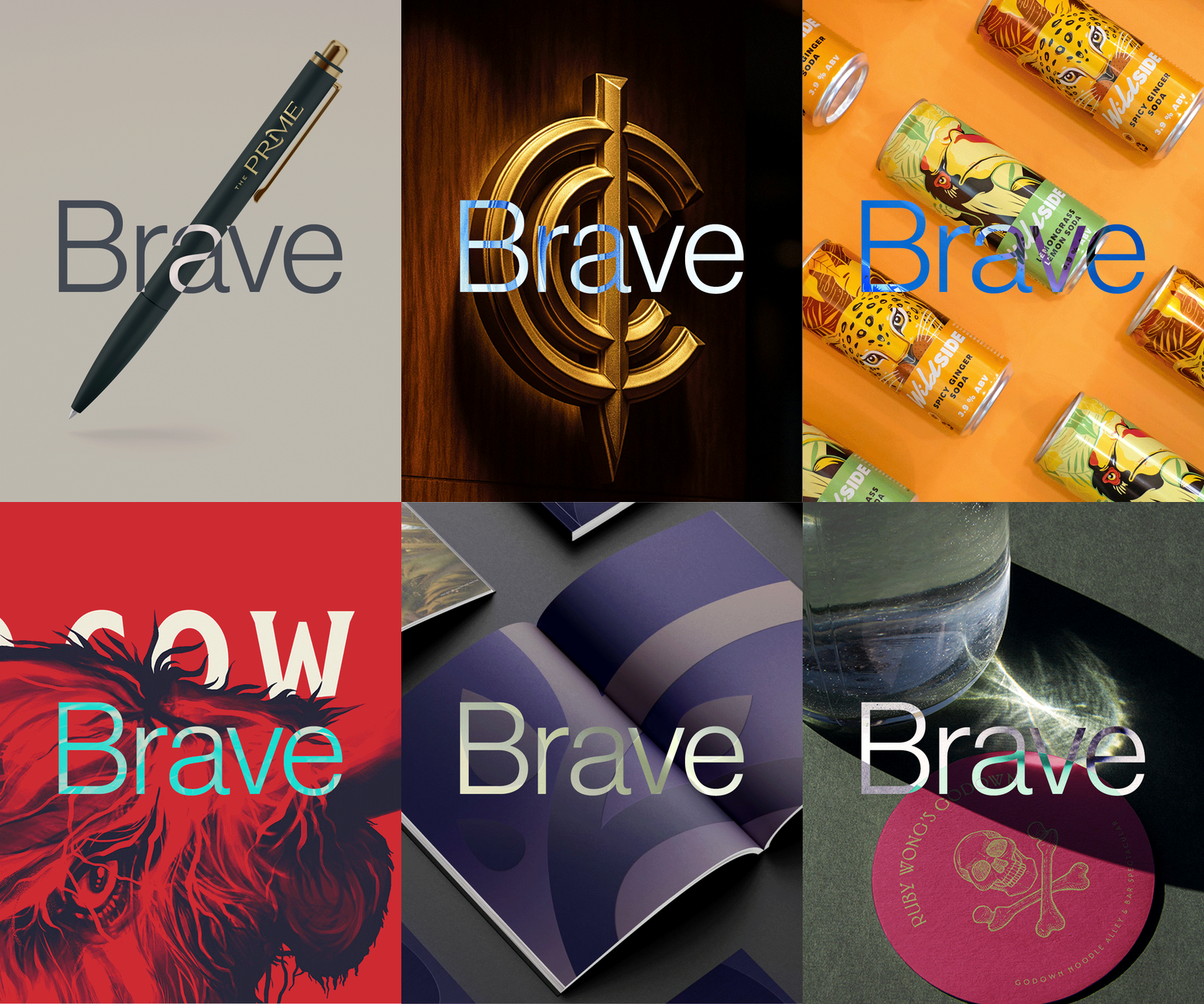
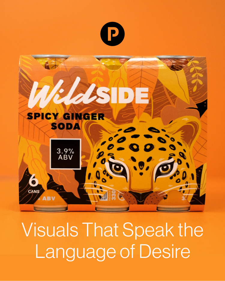
For Wildside, Rooster Beers came to us looking to build something for a younger, more adventurous generation of drinkers in Vietnam’s crowded beverage market. Rather than start with trends, we started with the idea—unleash your wildside—and let that drive every decision from the dynamic typography and colour palette to how the range would travel across socials and physical retail.
There’s a difference between the brand that speaks to a younger audience and a brand that performs youth for them. The first earns recognition; the second a scroll-past.
Looking for packaging that feels fresh, relevant, and wholly yours? Let’s talk and create something people pick among a crowded shelf.