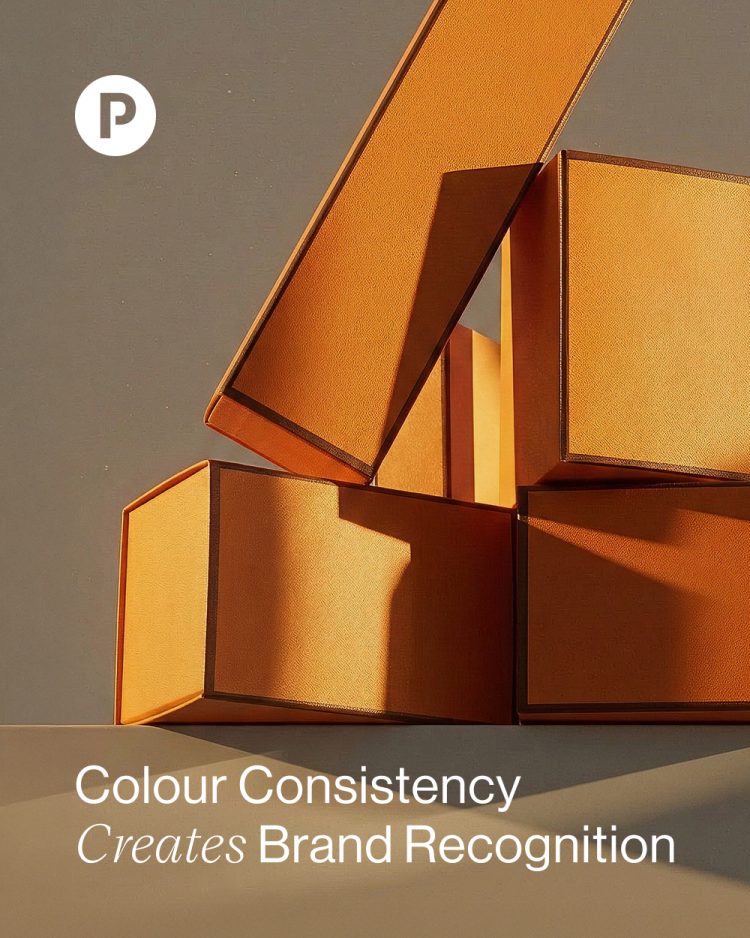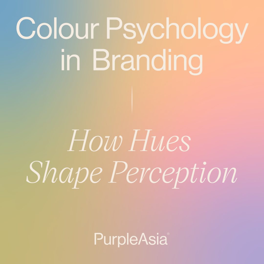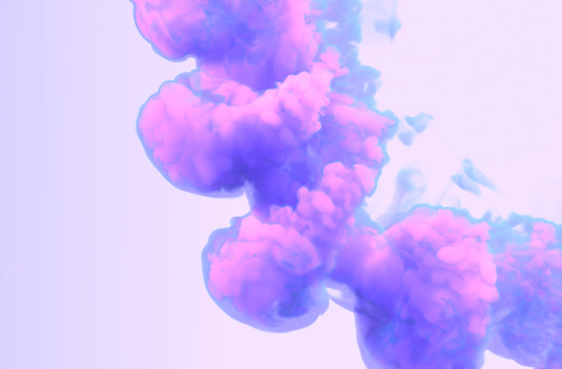
Pinterest forecasts five dominant colours for 2026: Plum Noir. Wasabi. Cool Blue. Persimmon. Jade.
They’re bold, expressive, emotionally charged, with each carrying a psychological weight:
– Plum Noir signals depth and intrigue.
– Wasabi speaks to rebellion and individuality.
– Cool Blue calms and clarifies.
– Persimmon radiates warmth and vitality.
– Jade suggests balance and quiet strength.
In uncertain times, colour becomes emotional shorthand. People gravitate toward tones that regulate, energise, or ground them. But here’s the nuance, trend colours shouldn’t replace brand systems. You don’t see the strongest brands repainting themselves every January, do you? Instead, they selectively integrate cultural signals in ways that reinforce their core identities.
For some projects we’re currently developing, these tones aren’t trends at all, they align naturally with deeper narratives around vitality, renewal, and place. In those cases, colour becomes both timely and timeless—a key distinction. At the end of the day, chasing colour is reactive while interpreting it strategically is brand leadership.
If you’re considering how 2026’s palette fits into your brand, let’s make sure it strengthens the work you’ve already put in.
Related News