In a fast-skip world, you have 1.7 seconds to be recognised or ignored.
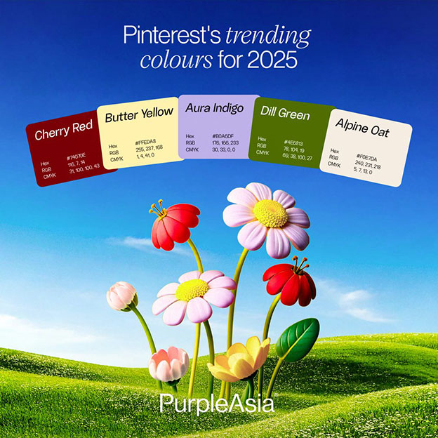
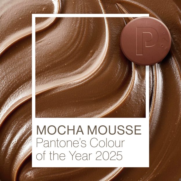
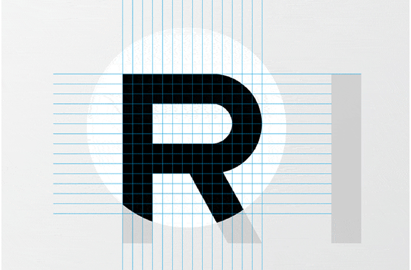
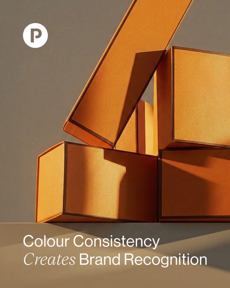
Colour is one of the fastest cognitive shortcuts to memory. It doesn’t just attract attention; it sets temperature, signals price point, and framing brand perception. In milliseconds, long before a headline is read or a logo registered, colour triggers emotion, association, and familiarity. In fact, studies show consistent colour usage can increase brand recognition by up to 80%. Which means if your palette is disciplined enough, your brand can be identified without a single word.
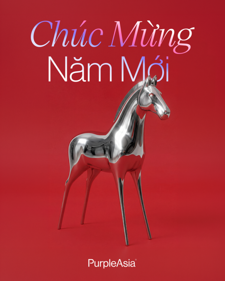
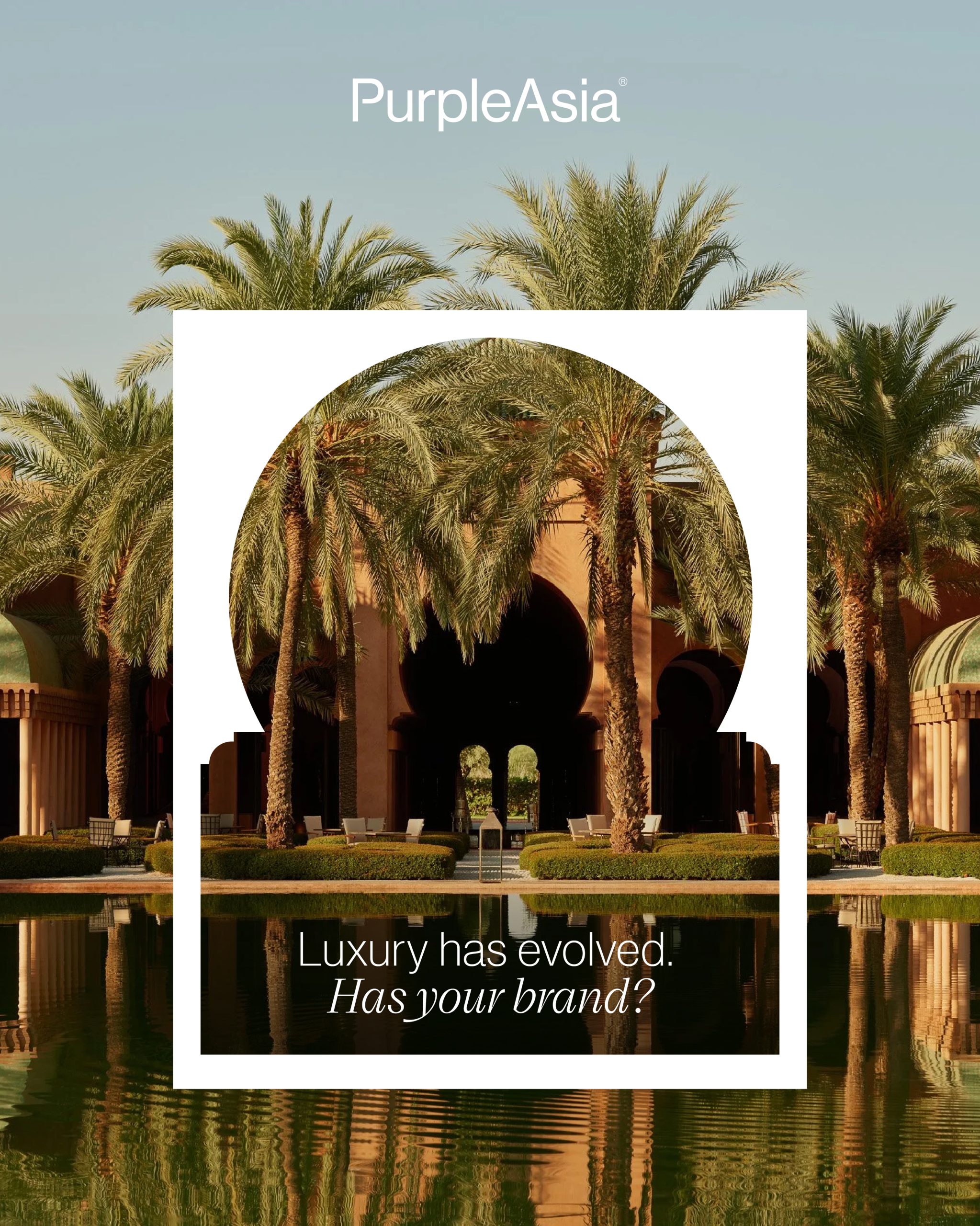
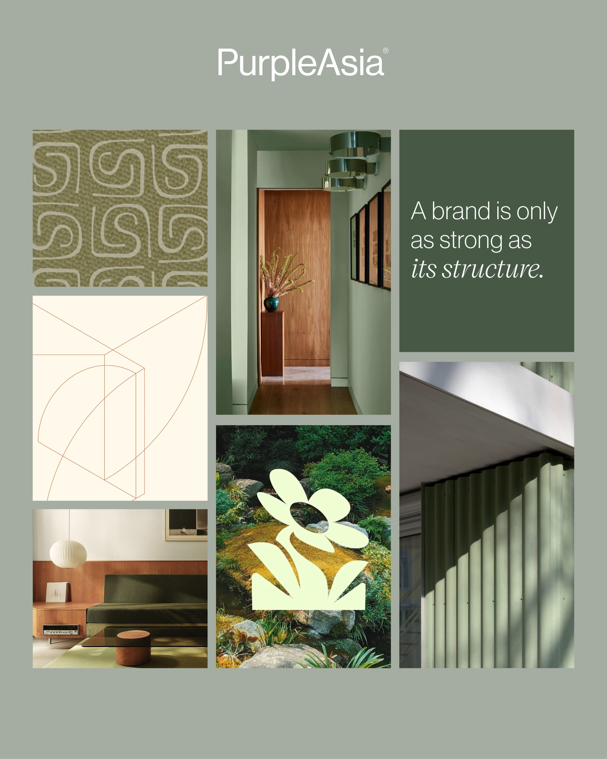
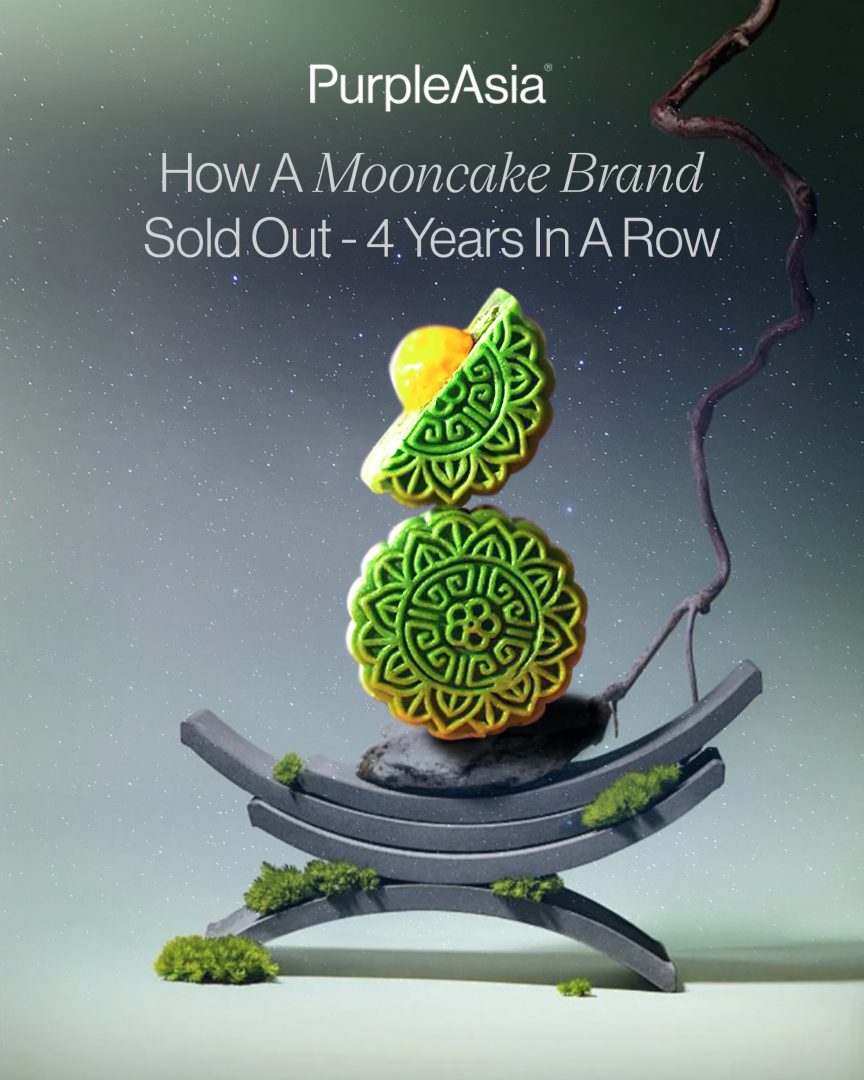
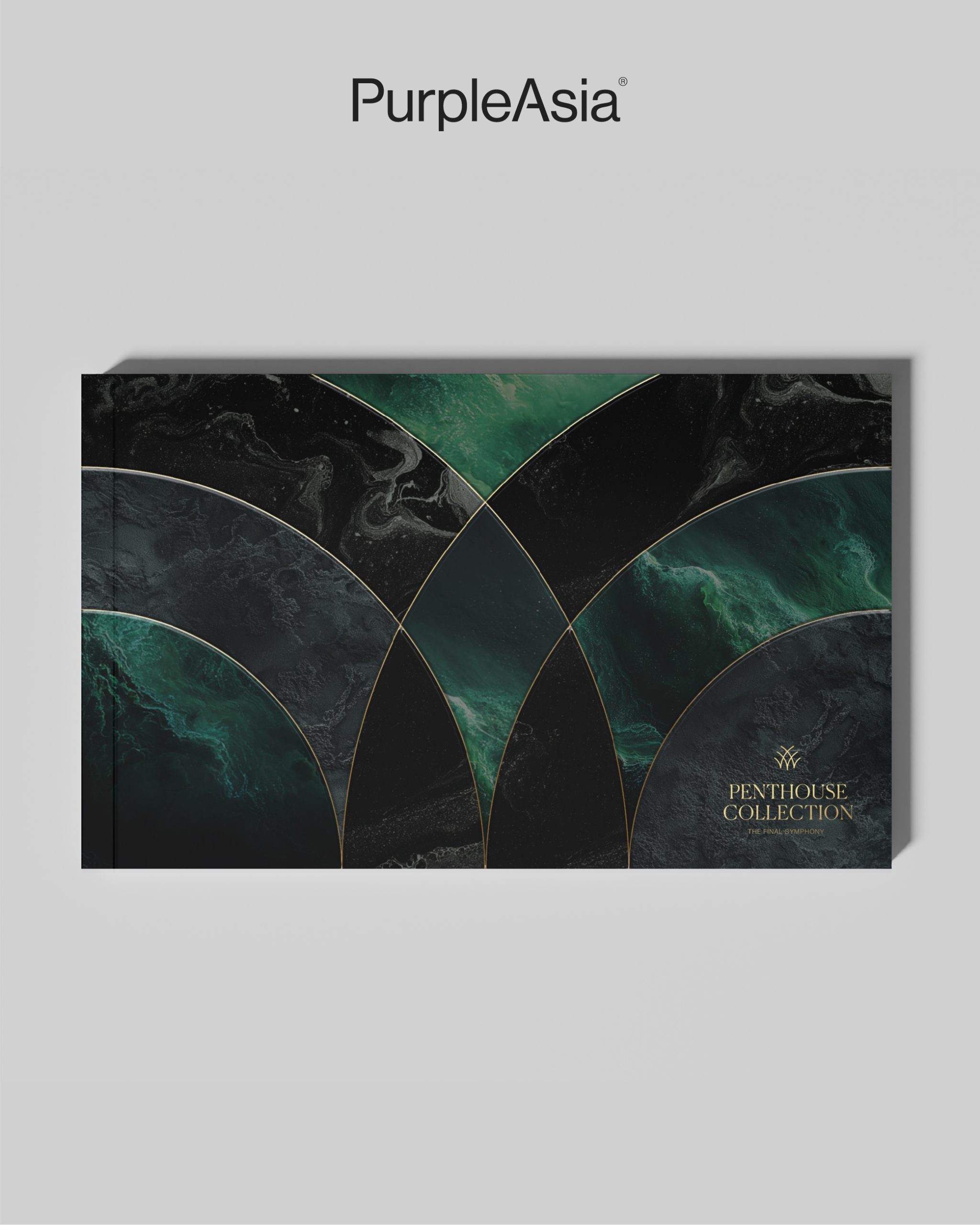
In culturally charged moments, like the reds and golds of Tet, collective memory amplifies this effect, and the smartest brands understand what the colours they choose already mean. We’ve applied this thinking in high-value property branding where colour was chosen based on emotionally grounded systems designed to age well with tones that signal permanence and legacy.
TL;DR? Don’t rotate your palette every campaign. Build one strong enough to carry equity for years. And if your brand colour feels cosmetic, it probably is. Let’s build one that feels inevitable.
Related News