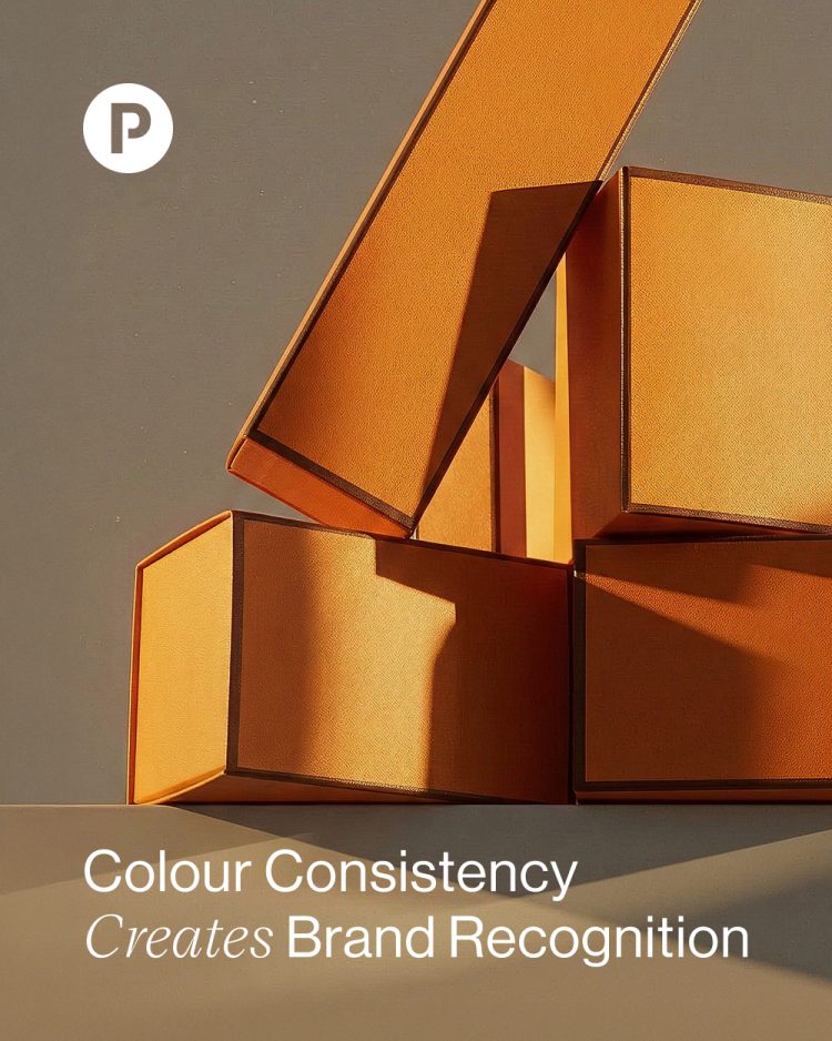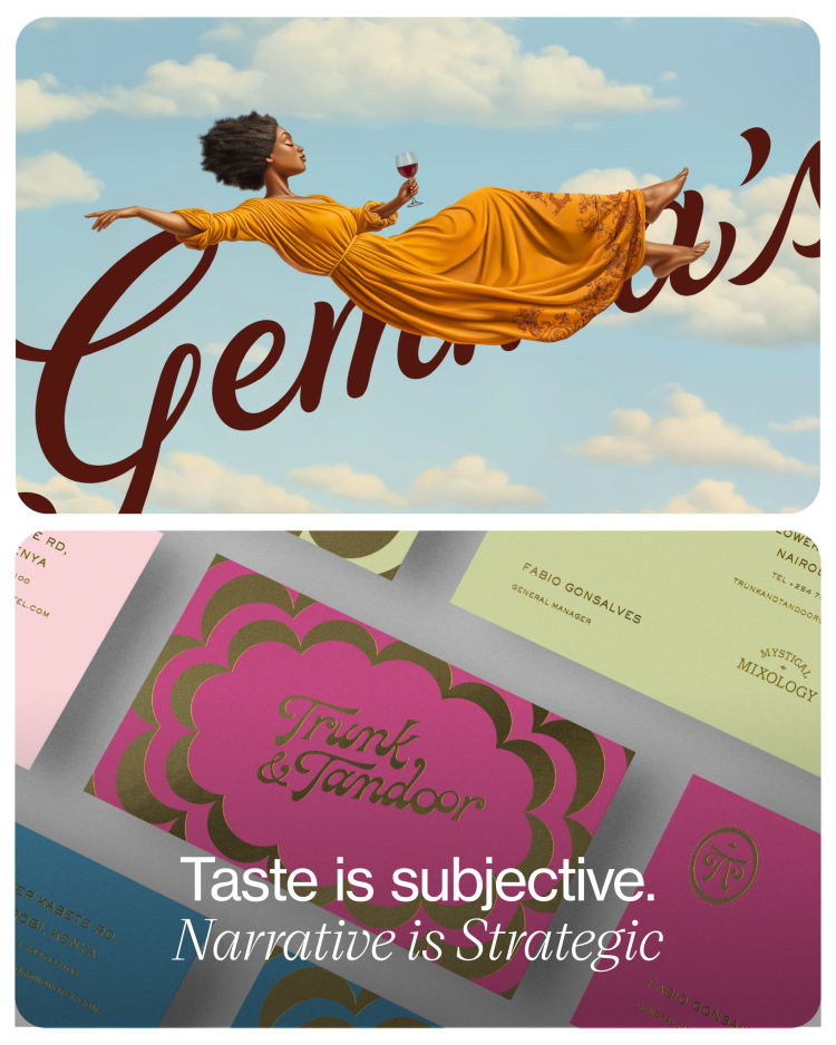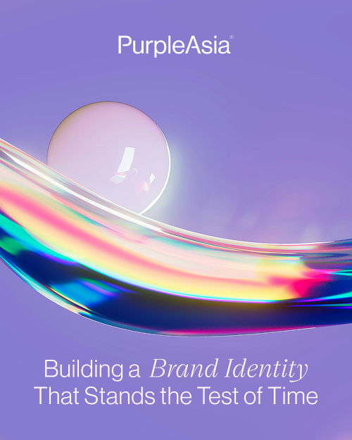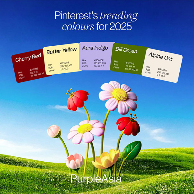
Colour is a powerful communication tool that can instantly evoke emotions and shape perceptions, making it an important reference in branding when creating impactful and memorable identities. For example, red is associated with excitement (think Netflix, Coca-Cola, and VietJet), passion, and urgency; blue represents reliability and professionalism (Facebook, LinkedIn, Petrolimex); and purple taps into regal and imaginative qualities (FedEx, Syfy, and PurpleAsia (!)).
However, it’s not one-size-fits-all. Cultural differences play a significant role in colour perception; for instance, while white represents purity in Western cultures, it’s associated with mourning in some Eastern cultures. So, when choosing brand colours, consider your audience and their background, your industry norms and how to stand out, the emotion and message you want to convey, accessibility for those with visual impairments, and, crucially, your competitive landscape.
Assessing the market when choosing colours ensures you’re not at risk of blending in with the competition—you wouldn’t launch another social media platform in blue would you (think Facebook, Twitter, AND LinkedIn)? Be sure to conduct a comprehensive analysis to identify a unique colour palette that will set your brand apart while ensuring it resonates appropriately with your target audience. Of course, as always, we can help!
 |  |  |
 |  |  |