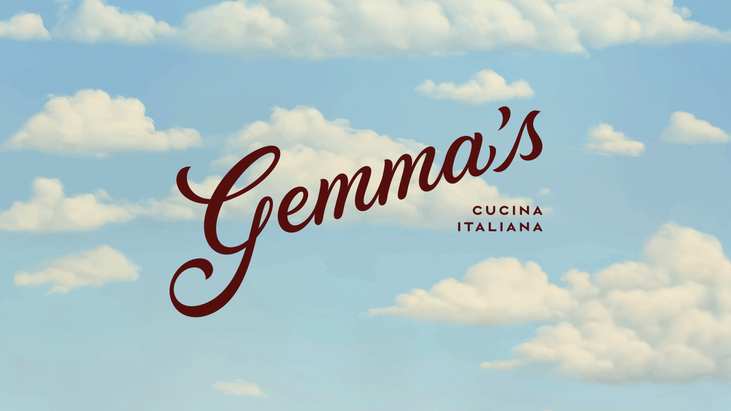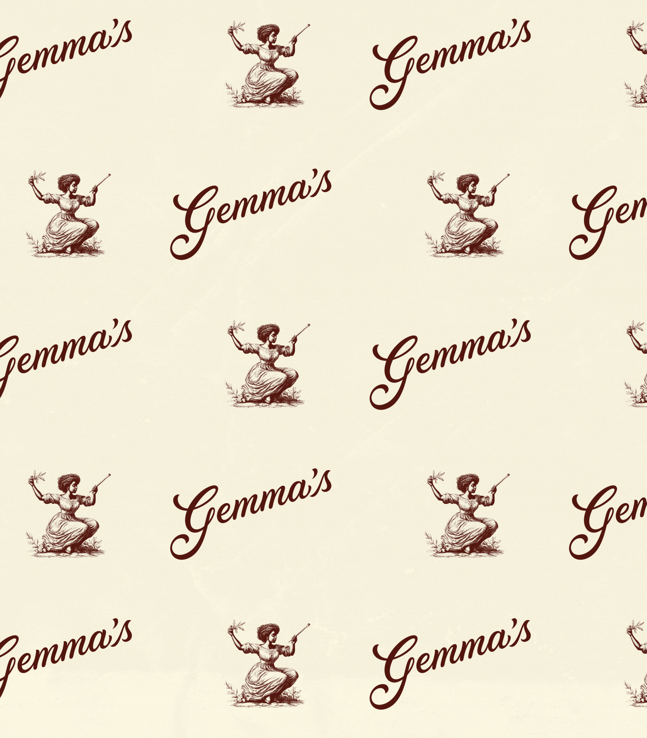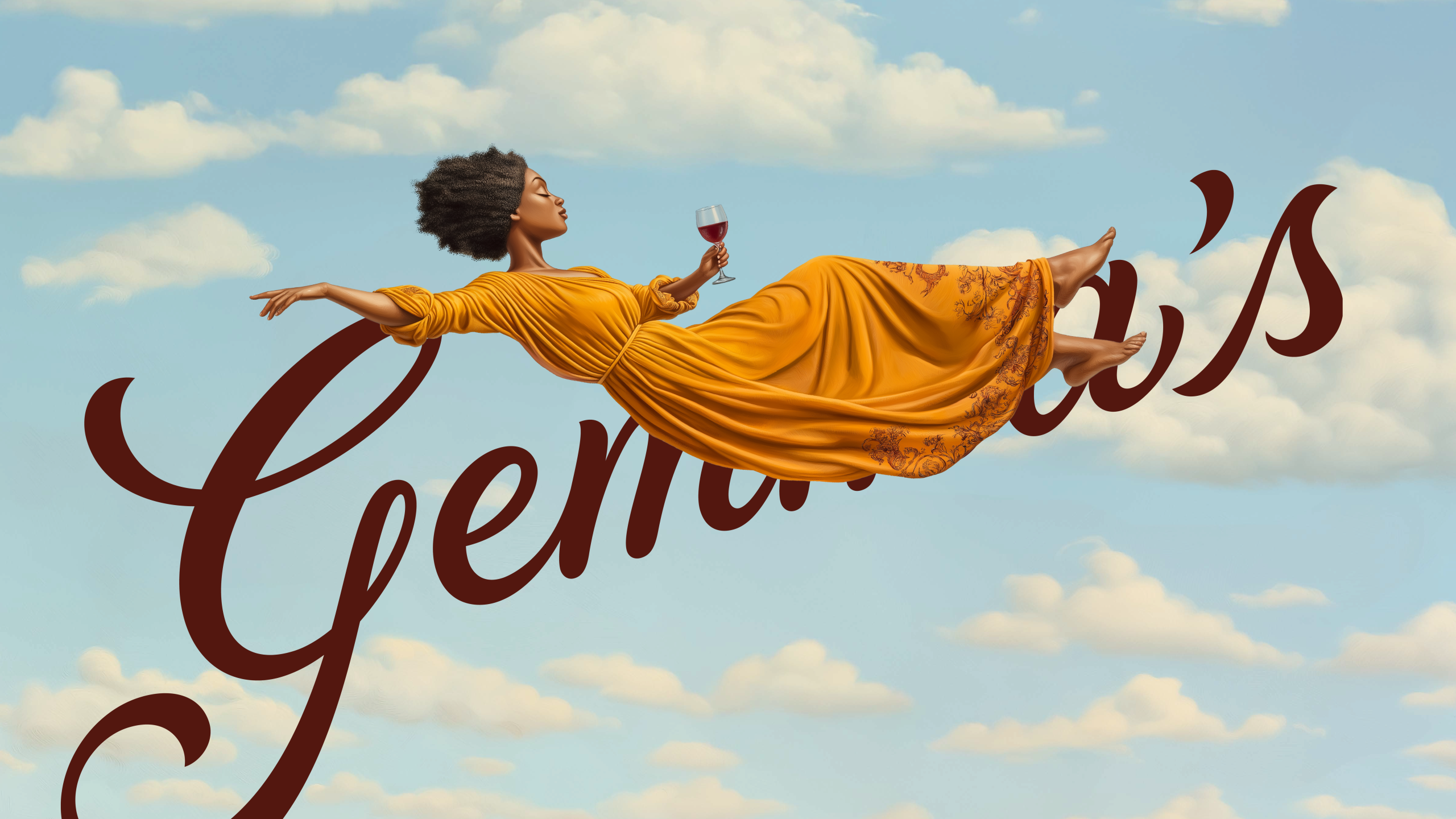
Gemma’s
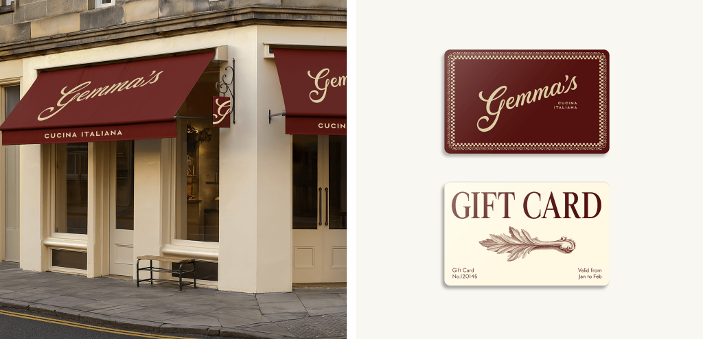
Gemma’s Cucina Italiana
A restaurant reborn through story, spirit, and soul.
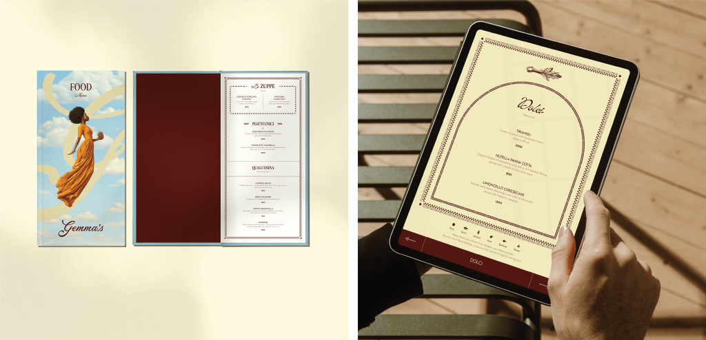
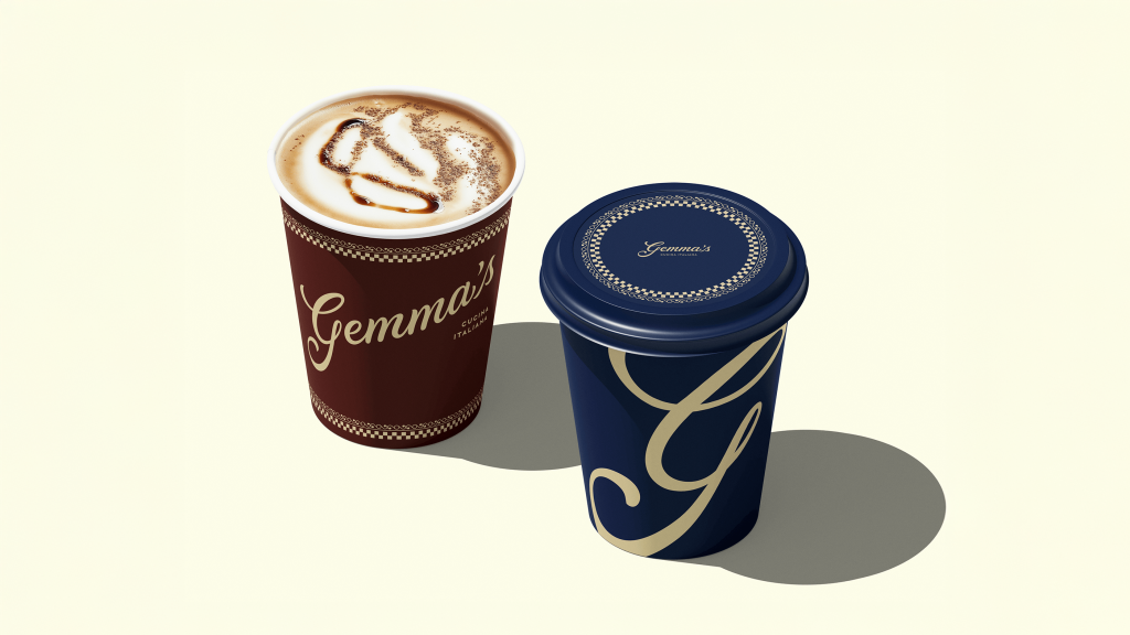
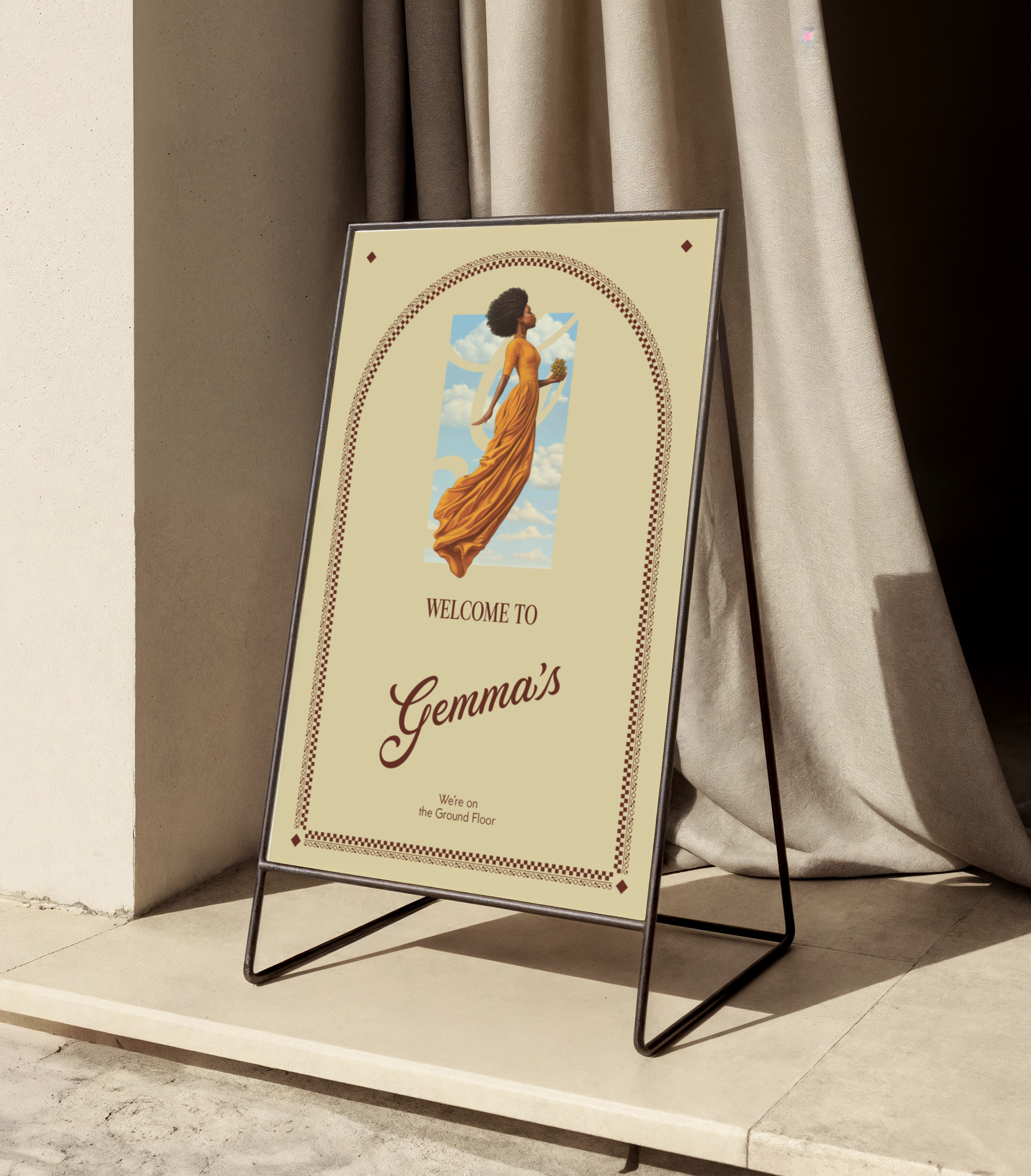
In the bustling heart of Nairobi’s Westlands district, an Italian restaurant with a stunning interior and compelling culinary vision opened its doors, but without a clear image or voice. Despite its operational potential and thoughtful hospitality, Gemma’s launched with a placeholder logo, no signage, and only partial menu designs. What it offered in food and service, it lacked in clarity and cohesion. Without a guiding story or visual presence to unify its touchpoints, the guest experience felt unfinished.
The pressure mounted quickly. With soft opening already underway and full launch looming, the team needed to transform a provisional restaurant brand into a living, breathing identity that could emotionally resonate with guests, inspire staff, and anchor Gemma’s firmly within Nairobi’s competitive culinary scene.
That’s when PurpleAsia stepped in.
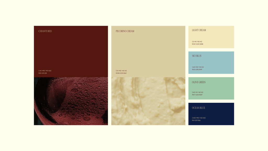
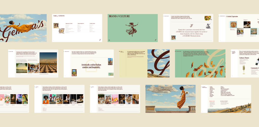
Reimagining Identity Through Narrative
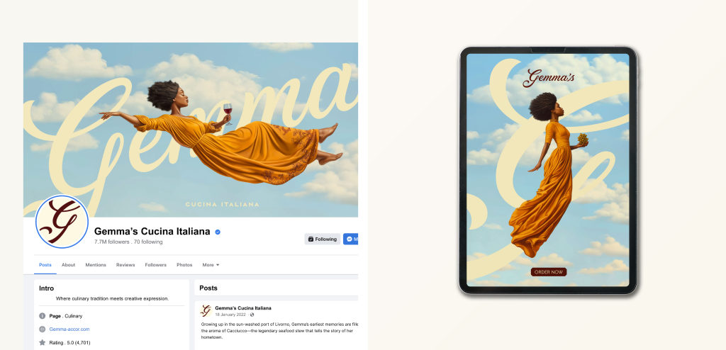
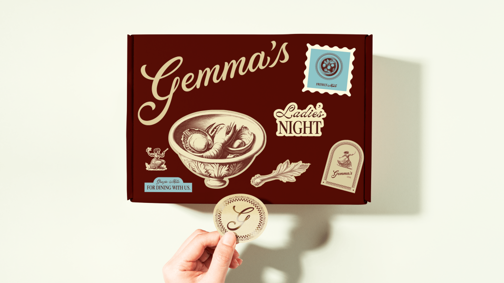
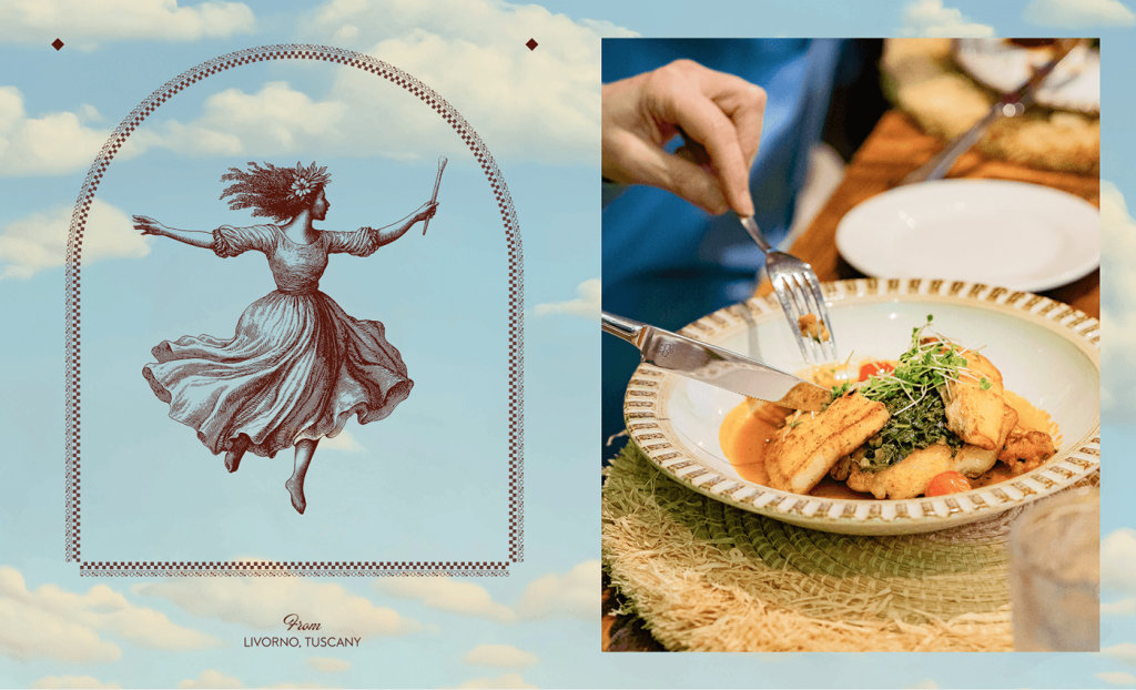
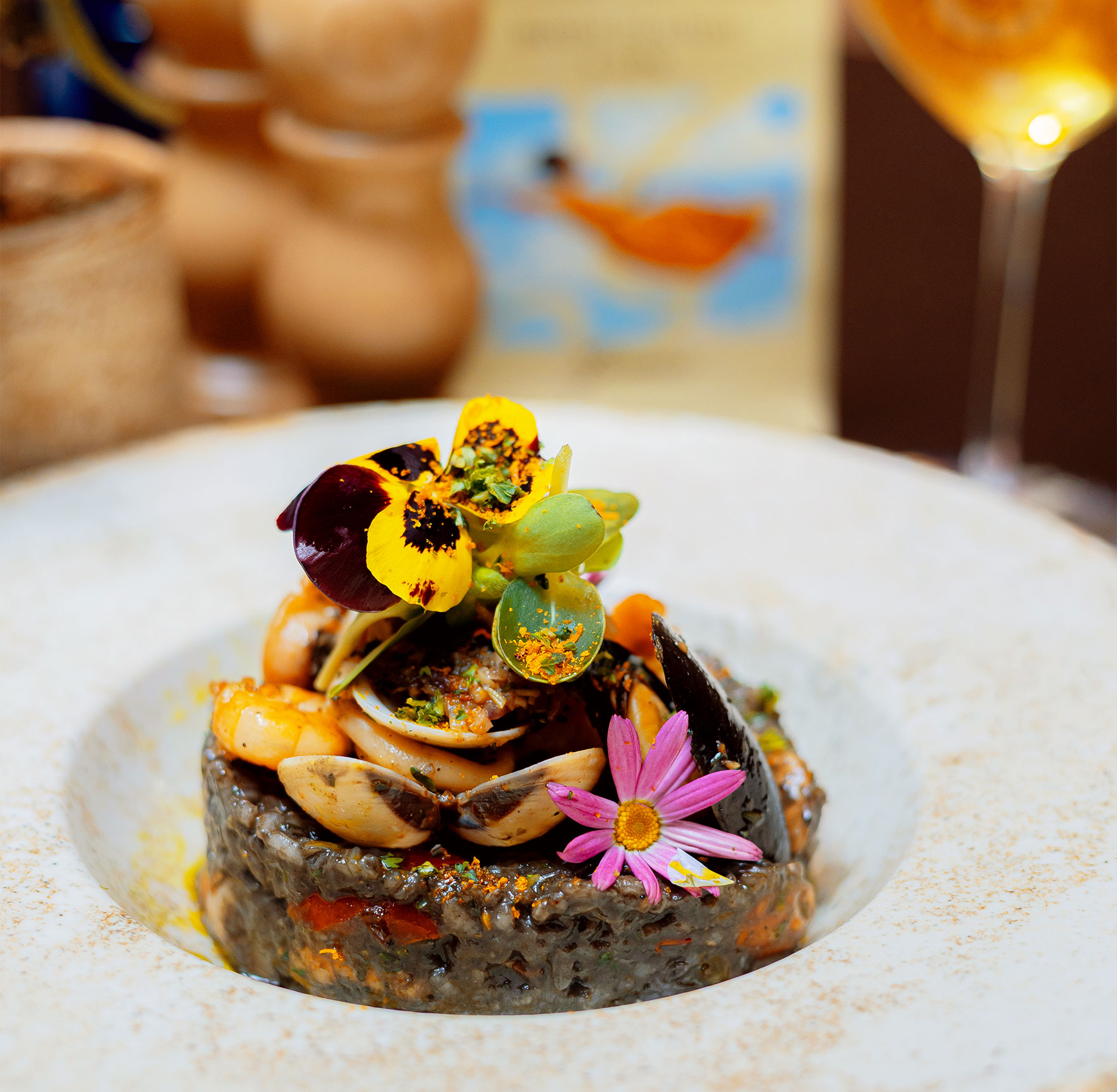
Our concept reimagined Italian dining through an artistic lens. At its core was artist and muse: Gemma. A painter-turned-chef raised in the sunlit port city of Livorno, Gemma’s earliest memories are steeped in the aroma of Cacciucco, the iconic seafood stew that captures the essence of her coastal hometown.
We brought this fictional character to life as a fully formed persona, full of memory, warmth, and creative spirit. It’s Gemma that welcomes guests, stirs the sauce, curates the wine, and leaves her flour-dusted fingerprints across every page of the menu. She is both artist and artisan. Through her, Gemma’s Cucina Italiana becomes a canvas for flavour, heritage, and human connection.
The Result
From a venue with no signage and a fractured identity, Gemma’s has become one of Westlands’ most distinctive and emotionally resonant dining experiences.
Through narrative, identity, and experience, PurpleAsia gave Gemma’s an alluring soul.