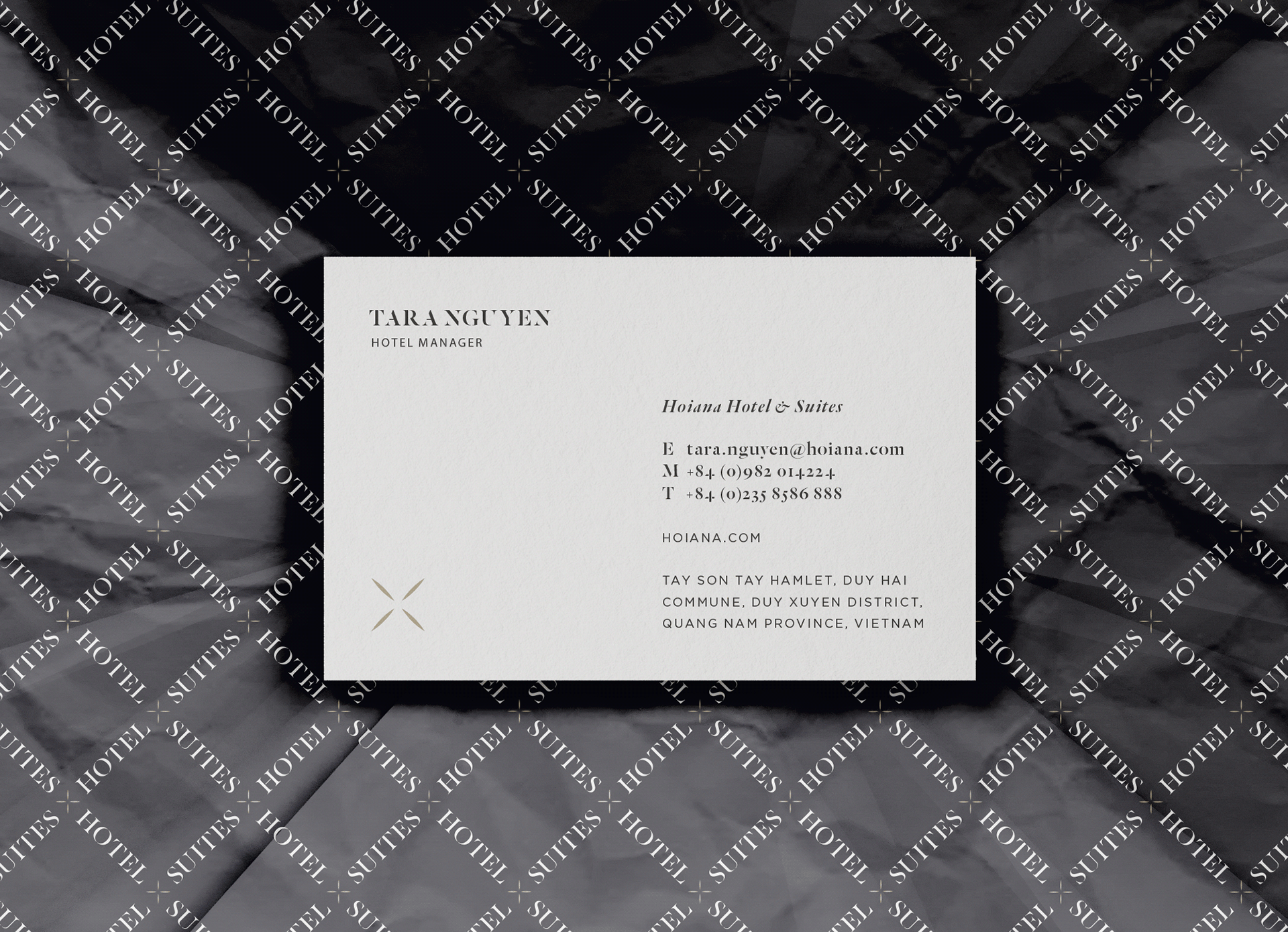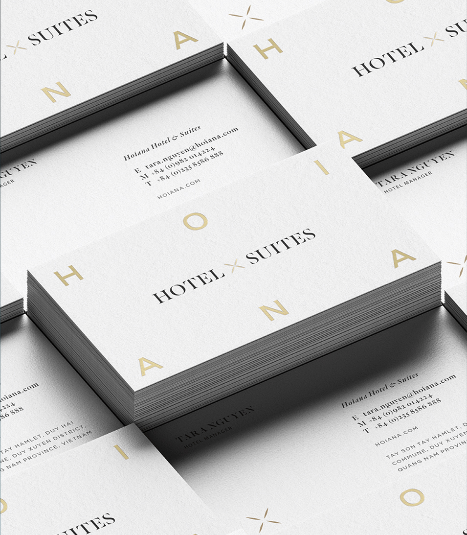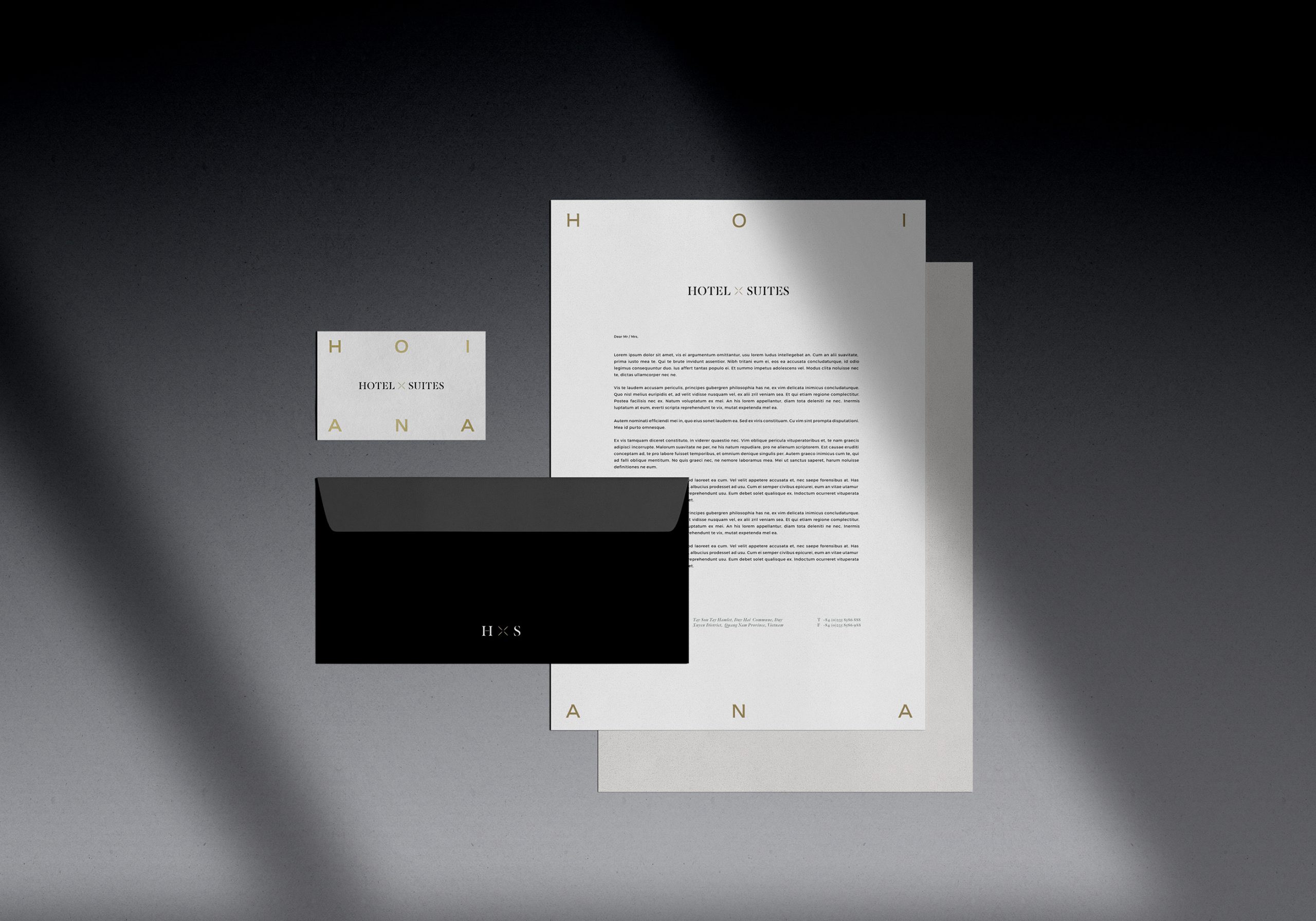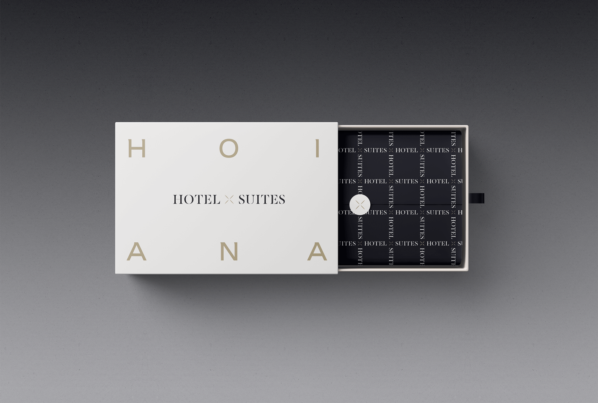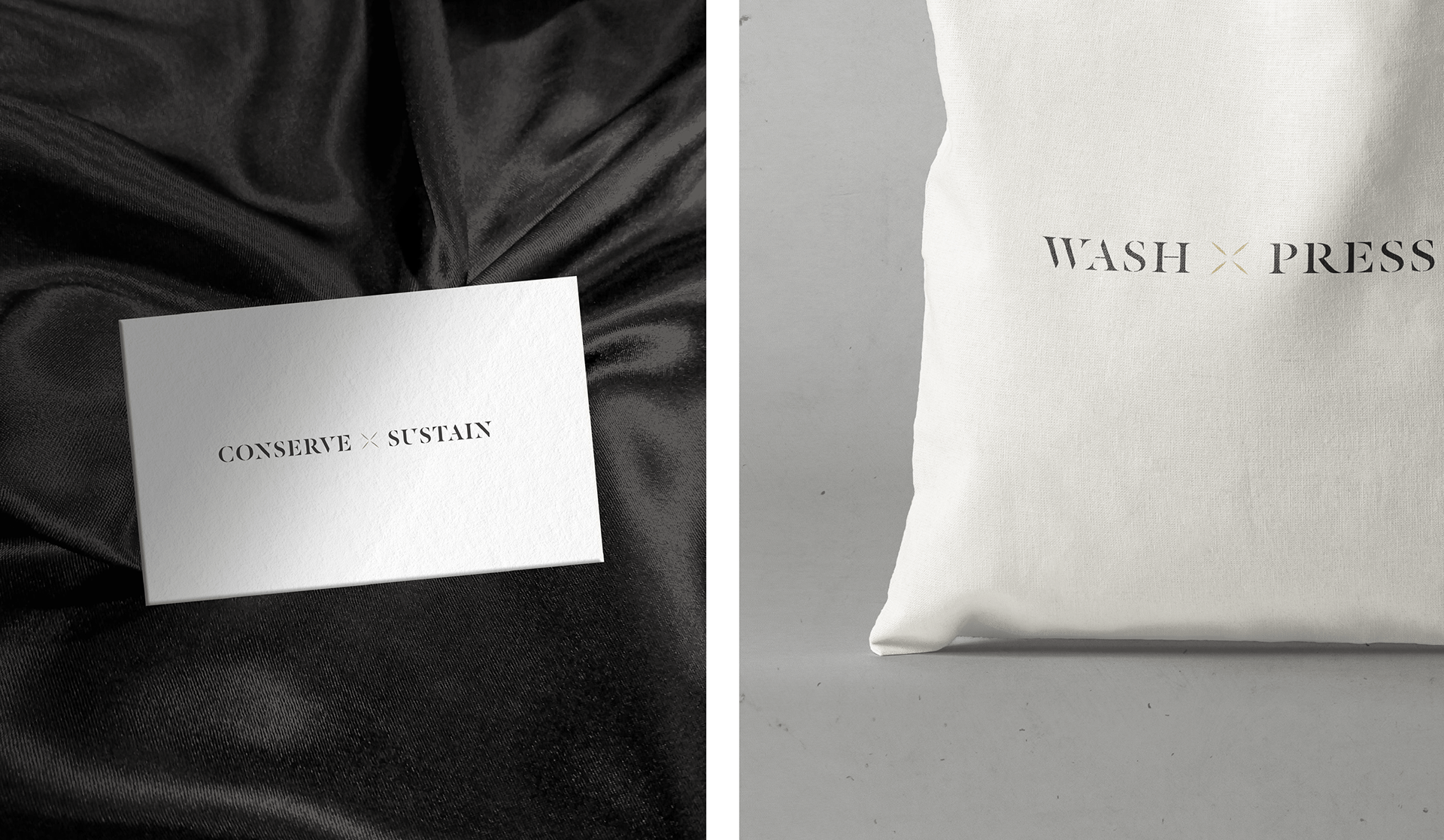
Hoiana Hotel X Suites
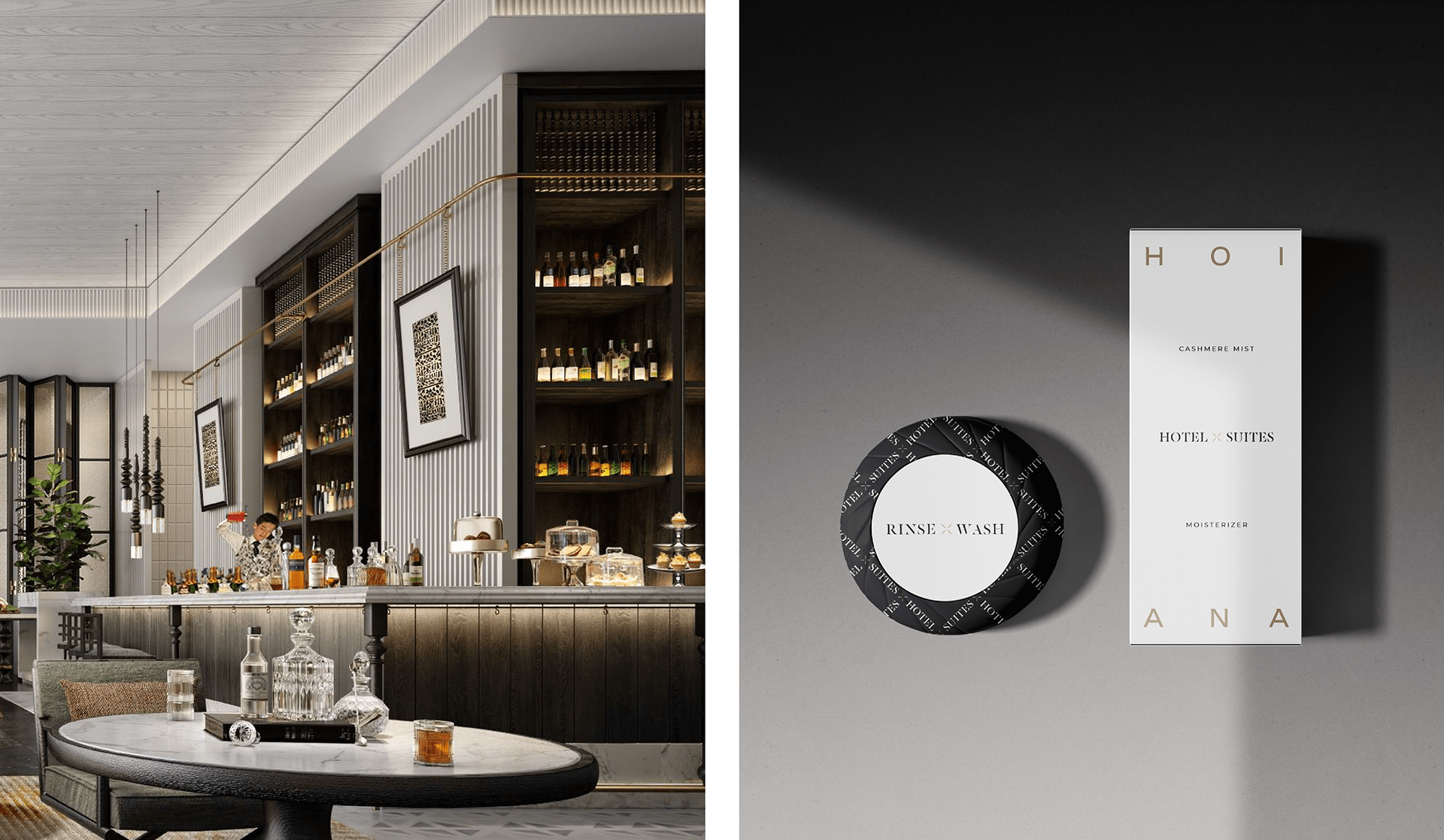
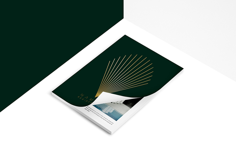
As the fourth accommodation type and a key part of Vietnam’s first integrated resort, Hoiana Hotel & Suites taps into the finer side of life, dialling up experiences and sensations to levels yet unseen in the country. In creating this brand, we wanted the logo to strongly link back to the Hoiana Masterbrand. Starting with a fresh slate, we incorporated elements of the firework symbol from the Masterbrand. Next, keeping the gold colour for consistency, we developed an abstract symbol from within the fireworks to capture the energy of the offer while incorporating elements of luxury and prestige for an altogether sharp and sleek identity.
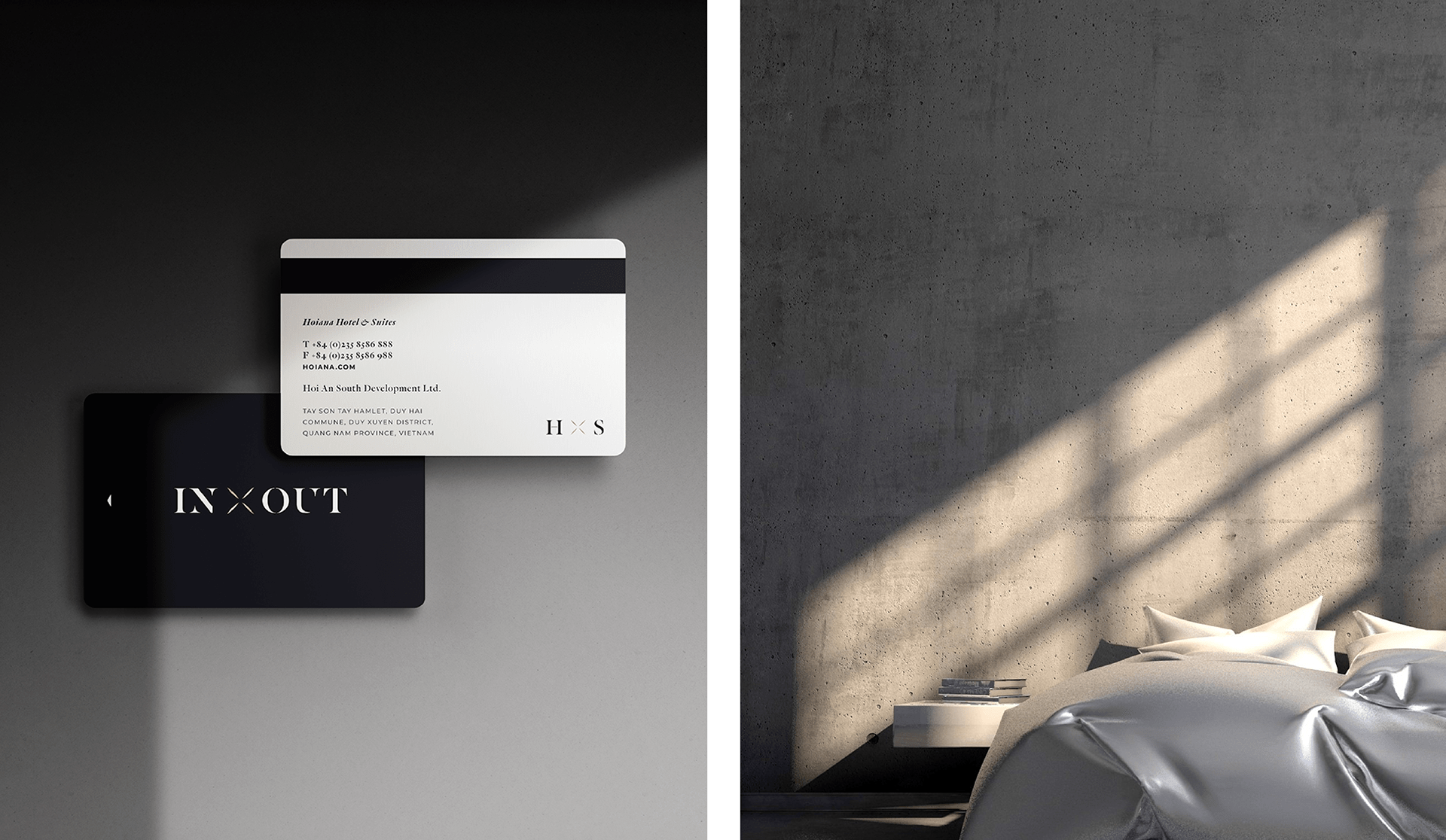
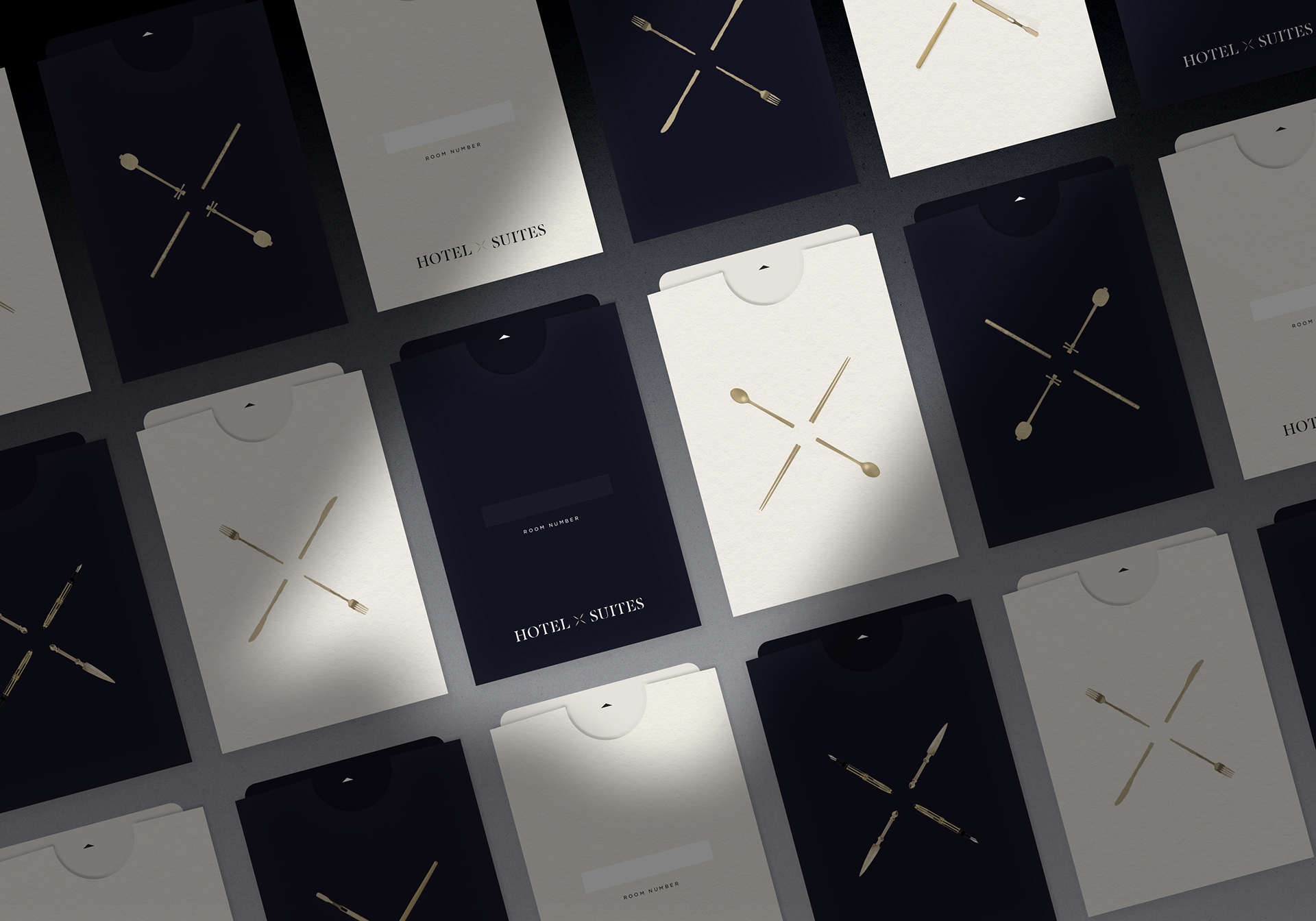
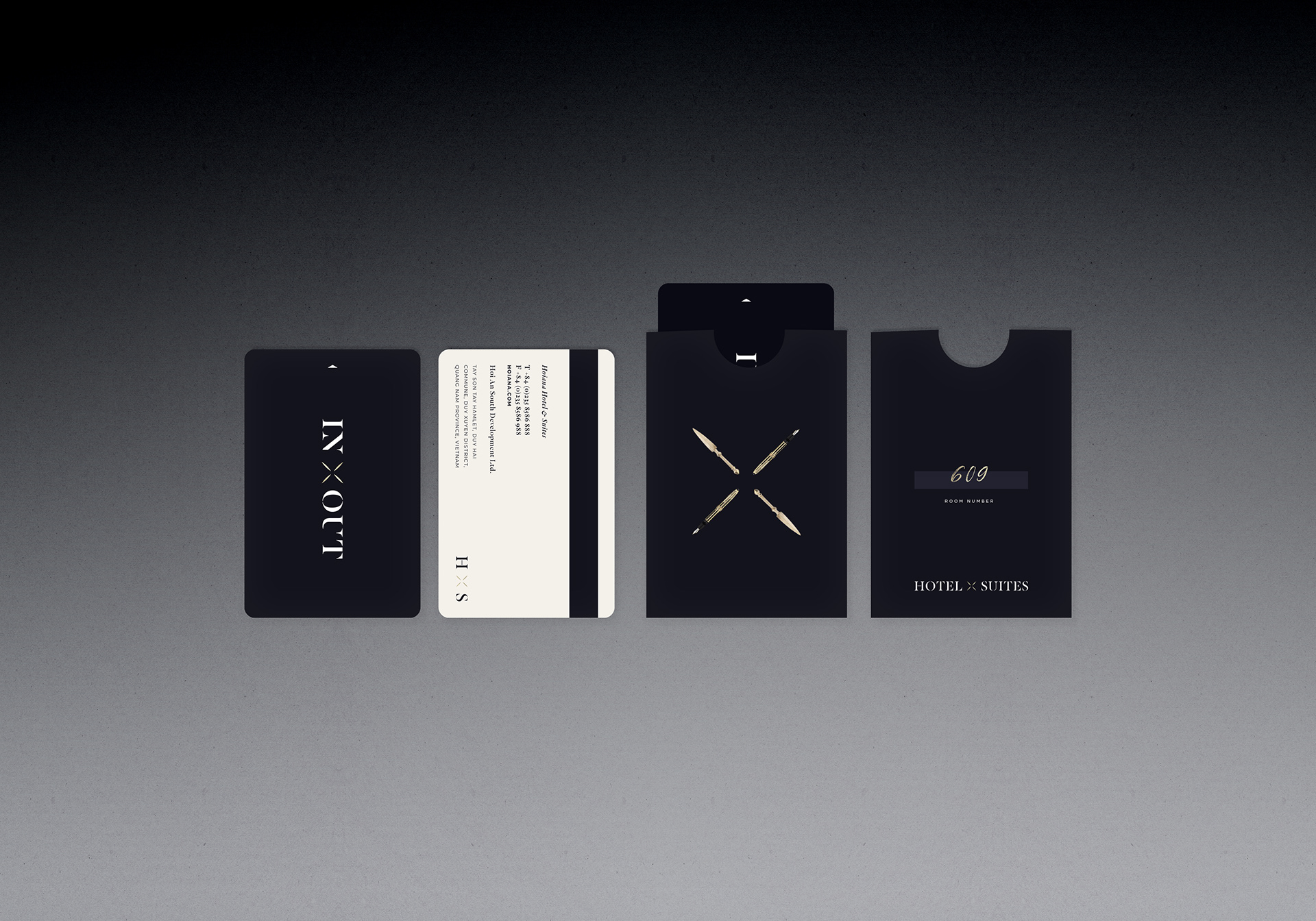
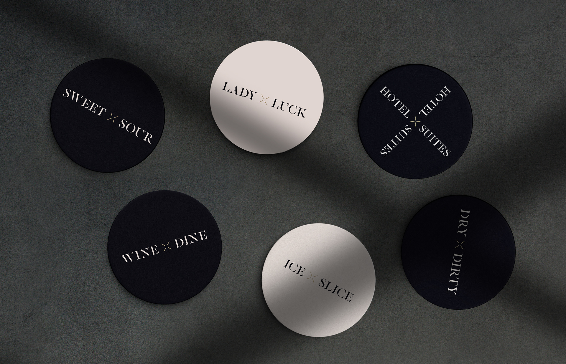
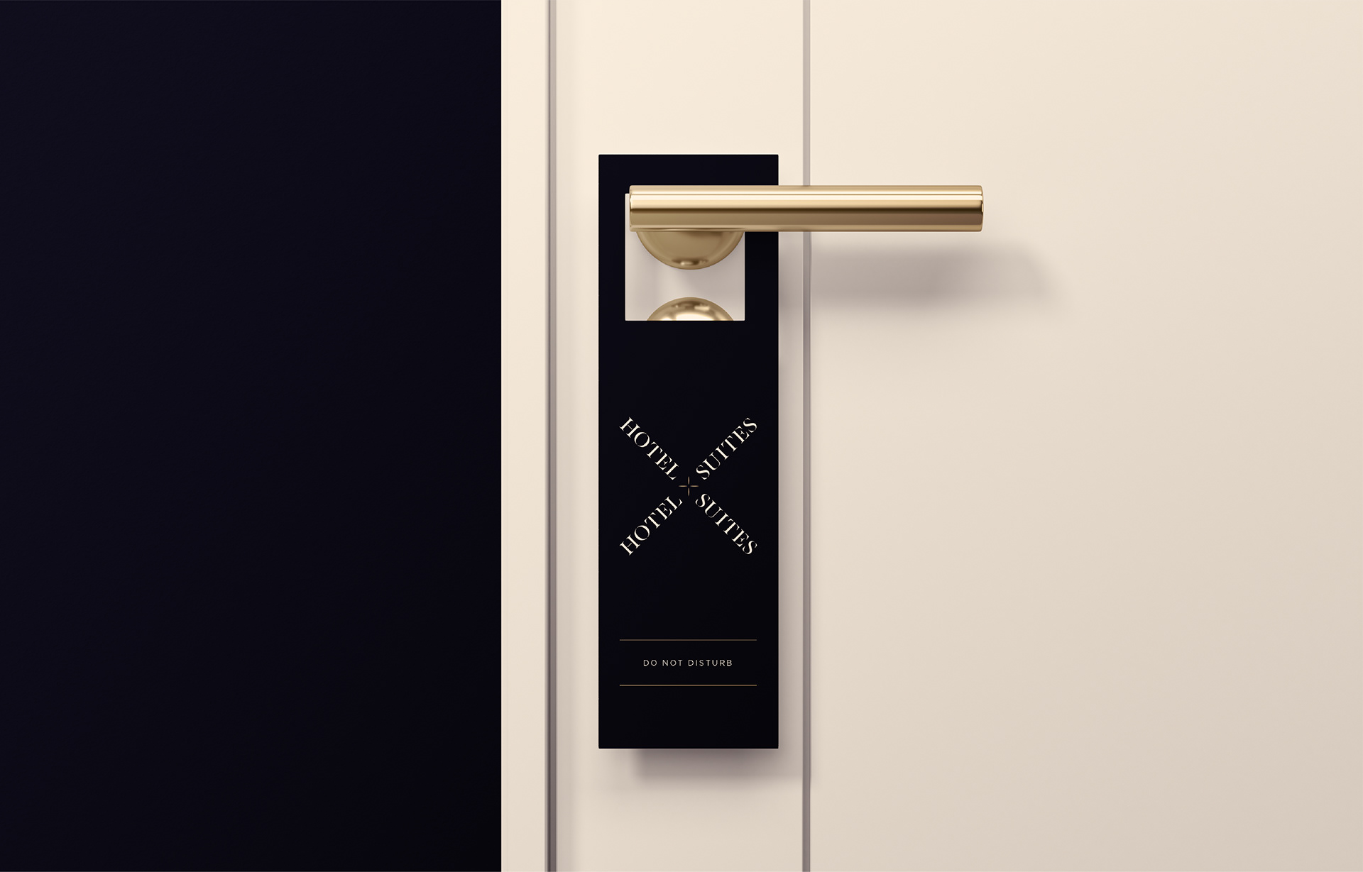
The typography, patterns, and TOV combine to create an alluring, exciting, and luxurious set of amenities and collaterals that are as graphic-led as they are refined.